Dragon Master is a computer sales and assembly service provider based in the United Arab Emirates, known for its high-quality, reasonably priced, and excellent after-sales service. With the growth of its business, the company wanted to enhance its brand image and introduce its own brand.
Dragon Master是阿聯酋的一家電腦銷售及組裝服務提供商,以其高品質、價格合理以及優良的售後服務而聞名。隨著業績的增長,業主希望能提升品牌形象並推出自有品牌。
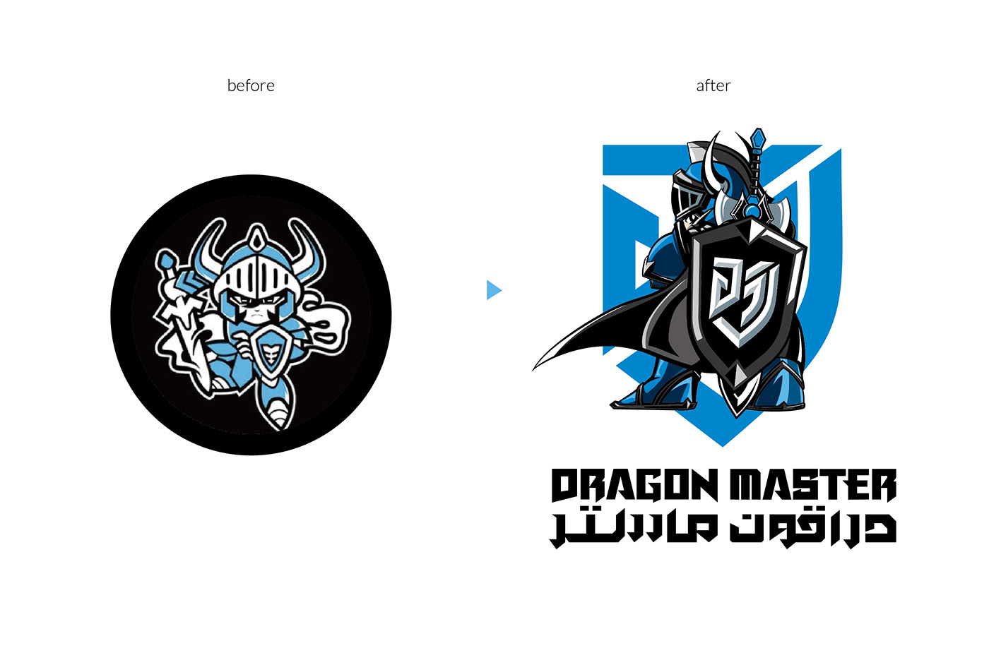
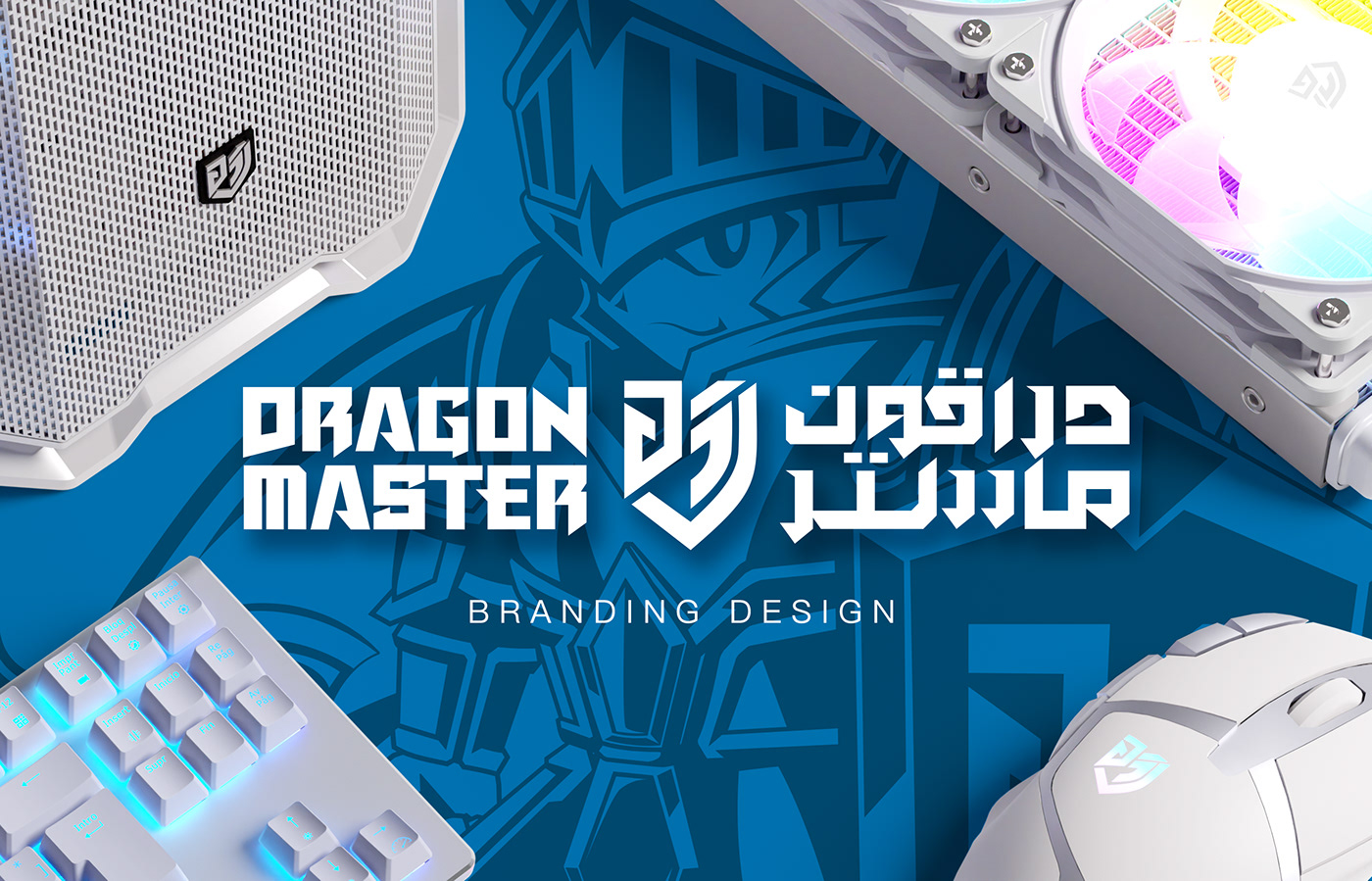
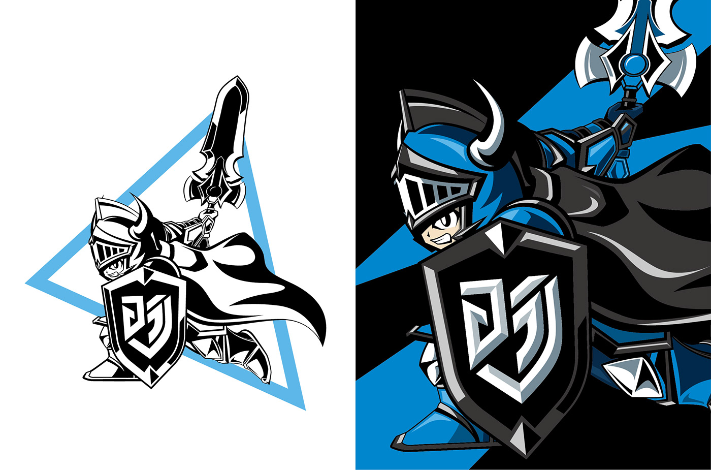
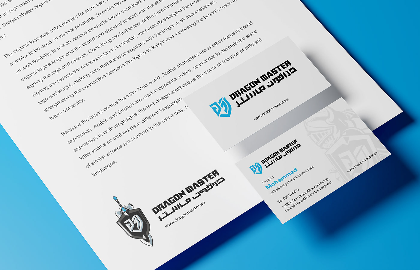
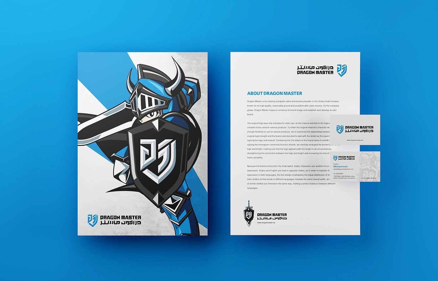
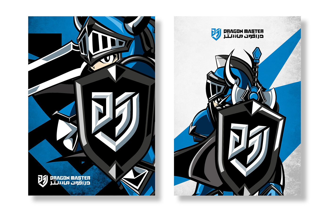
The original logo was only used for the store and its complex knight design made it difficult to apply to products. Therefore, in order to maintain the original knight's features and have sufficient flexibility to apply to various products, we redesigned the logomark by using the shield emblem that represents the knight's identity as the starting point. We transformed the brand's initials D and M into a monogram commonly seen in traditional shield emblems. We also redefined the knight as the brand's mascot, optimized its design, and developed its sword and shield as the primary design elements. The multiple combinations of logo and elements increase the brand's breadth and future application possibilities.
原本的logo僅用於店家,由於騎士造型過於複雜,難以應用在產品上。因此,為了保有原本騎士的特色,又能夠有足夠的彈性運用在各種商品上,我們以代表騎士身分的盾徽作為出發點重新設計logo圖示,將品牌名的首字母D和M,轉化為傳統盾徽中常見的花押字(Monogram),而原有的騎士則重新定調為品牌代言人,優化造型並增加細節,並發展出以劍盾為主的表現元素,多元的呈現方式增加了品牌的廣度和未來各種應用的可能性。


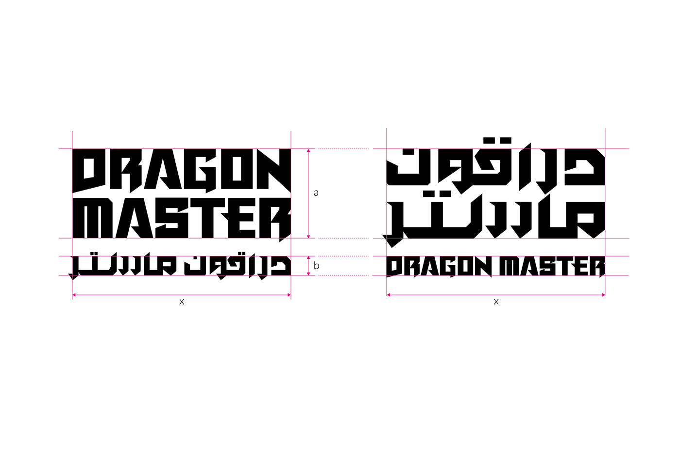
As the brand is primarily sold in the Arabic region, Arabic typography was an important consideration in the logotype design. On the other hand, the reverse reading order of Arabic compared to English posed the biggest challenge in the design process that needed to be overcome. In order to maintain the same visual weight for both languages in the logotype, we paid attention to evenly distributing the stroke width of different letters, so that words in different languages could maintain consistent widths. At the same time, we used the same details to end the strokes of letters that have similar structures, in order to achieve perfect harmony between the two languages.
因為品牌主要銷售於阿拉伯地區,所以在logo文字的設計上,阿拉伯文字是一個重要的考量因素。另一方面,阿拉伯文與英文相反的閱讀順序,則成為設計過程中最需要克服的挑戰。為了讓logo文字的兩種語言保有同樣的視覺比重,我們著重平均分配不同字母的字幅寬度,使得不同語言的單詞能保有一致的寬度,並在字母筆畫結構相似處以同樣的細節收尾,為兩種語言之間做出完美的調和。
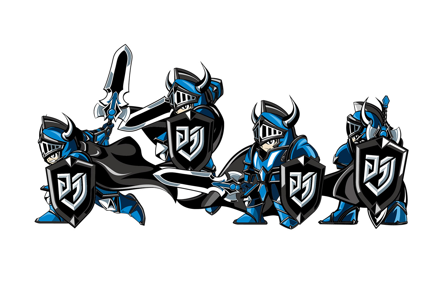
We designed various gestures for the knight to increase the brand's flexibility for various usage scenarios. Regardless of the situation, the knight's shield always faces forward to avoid too much focus on the knight himself, maintaining his position as a brand ambassador. Additionally, the knight is composed in a triangular manner to create dynamic visual effects, making the character more lively and able to create a passionate and energetic atmosphere for gaming. At the same time, we carefully arranged the presentation of the logo and knight, allowing them to appear together in any situation, further strengthening the association between the logo and the knight, and making the brand image more rich and complete.
為了搭配各種使用情境,我們為騎士設計了多種動作,以增加品牌的可塑性。無論在任何情況下,騎士的盾牌永遠都朝向前方,這樣可以避免視覺焦點過於集中在騎士本身,使其維持在品牌代言人的定位。此外,騎士是以三角形的方式進行構圖,以製造出動態的視覺效果,使角色更為生動,也能夠營造出電競的熱血與活力氣氛。同時,我們巧妙地安排了logo和騎士的呈現方式,讓兩者在任何情況下都能一起出現,進一步強化logo與騎士的關聯性,並使得品牌形象更為豐富且完整。

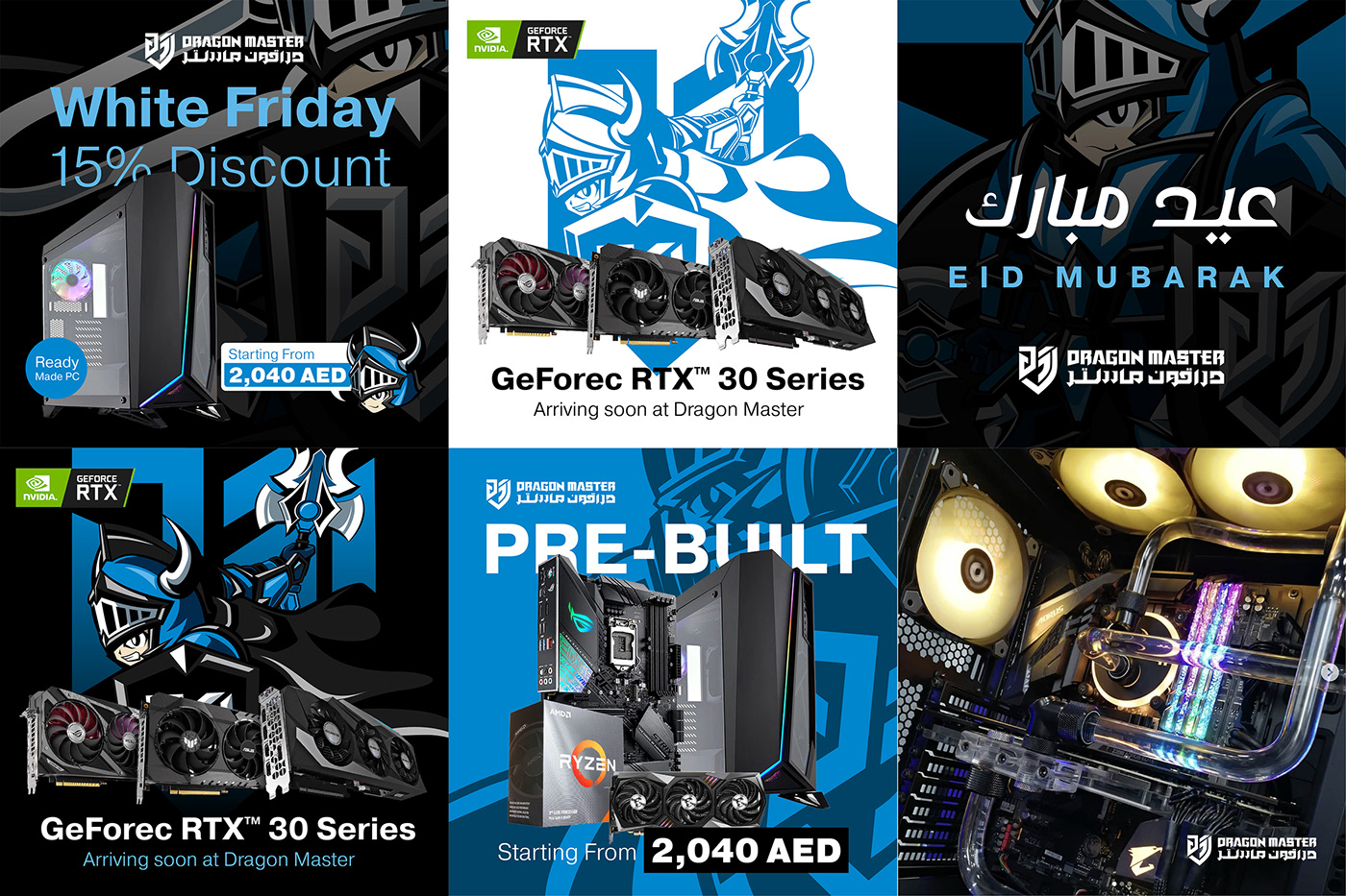
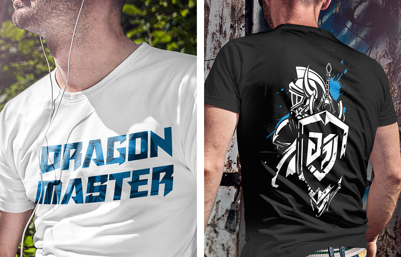
We not only focus on the visual system of the logo and mascot but also place great emphasis on the brand's social media and merchandise. Therefore,we designed a series of social media templates that can quickly correspond to the main types of posts and create diverse post images by replacing the mascot with different gestures. Additionally, we diligently designed merchandise, mainly T-shirts, to showcase the brand image in a youthful way and attract more game players.
除了logo與吉祥物的視覺系統,我們也非常注重品牌經營的社群媒體和周邊商品。因此,我們設計了一系列的社群媒體版型,能夠快速對應主要常見的貼文類型,搭配替換不同動作的吉祥物,便能夠製造出多元的貼文圖片。同時,我們還以T-shirt為主設計了周邊商品,以年輕的方式展現品牌形象,吸引更多玩家的注意。